At 434 Marketing, we’re committed to dedicated processes that generate meaningful results for our clients. The world of content marketing is complex and always changing – not to mention incredibly competitive. Each piece of content on your website should serve a purpose, whether that’s generating traffic, warming up visitors to convert, or educating leads to make the decision to partner with your organization.
One of the most important, but often overlooked, aspects of a solid content marketing strategy lies in refining and refreshing content. We’ve all heard the old adage, “If it’s not broken, don’t fix it.” It’s a valid, common thought to have. If a post or page is performing well, why touch it?
But the painful truth is, every piece must be made well and be sustained with regular maintenance. And an even more painful truth – sometimes, even excellently crafted content misses the mark. A post may not rank on the first page of the SERP, or a CTA may not capture leads as intended.
If you’ve ever sat scratching your head wondering what to do to capitalize on the success of a content piece or how to fix an article that’s broken, you’re not alone. We’ve been there, too, and we’ve found a simple, data-driven solution to evaluate user behavior on posts and pages.
As part of our content refreshing process, especially long-form content, we often utilize heatmaps to analyze how visitors are engaging with the content in order to reduce friction in the user’s experience.
In this article, we’ll cover:
- What heatmaps are
- How to use heatmaps
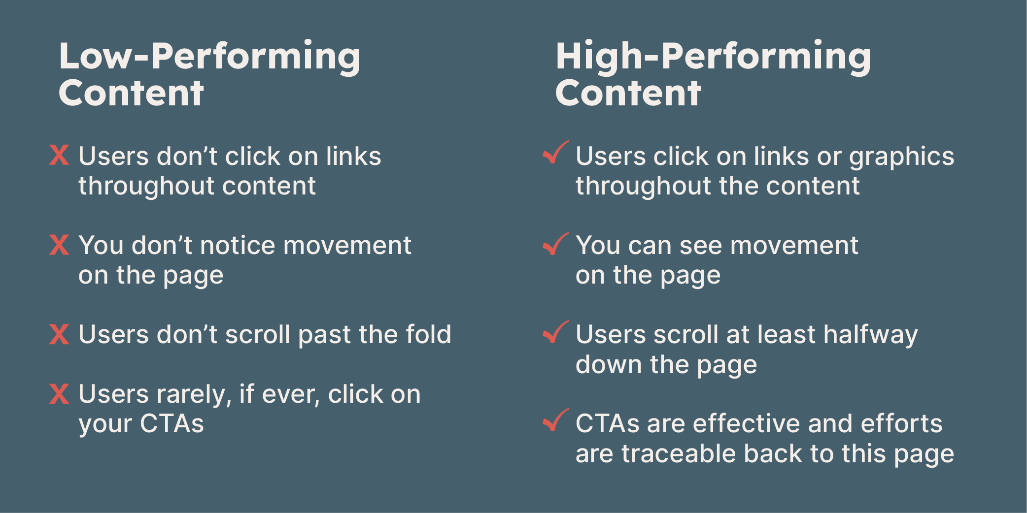
- What we look for in movement, scroll depth, and attention heatmaps
- Next steps following heatmap analysis
 Heatmap example
Heatmaps allow us to learn more about our target audience and tailor our content to better serve them while simultaneously bolstering search results.
Each piece of content we create is the result of thorough research, creativity, and dedication to our clients’ goals. Once a piece of content ships, we monitor how it’s doing, and strive to make it better. We found that introducing heatmaps was an excellent way to let the reader show us what they’re most interested in, and what we needed to tweak. With a whole lot of curiosity and a dash of problem-solving, a content marketer can use heatmaps to take a piece of content (home page, product page, blog, landing page, etc.) to the next level. Here’s how we like to use heatmaps.